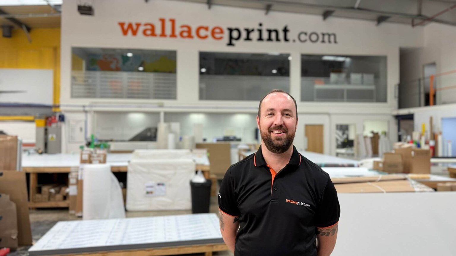
Miss Millie’s Canterbury & Wallace Print: From Vacant Unit to High-Street Landmark
Opening a new hospitality venue on a busy UK high street involves far more than fitting out a kitchen and opening the doors. For Miss Millie’s, opening a new franchise restaurant in Canterbury, the challenge was to establish a strong, confident brand presence from the very first moment, even before the store was ready to trade. Visual communication needed to work hard, not only to attract attention, but to build trust, curiosity, and anticipation among a constant flow of local residents, students, and tourists passing through the city centre.
From the outset, it was clear that print and signage would play a critical role in the success of the opening. Located in a high-traffic area of Canterbury, the shopfront would be visible to thousands of people each day. Leaving the windows bare or partially obscured during refurbishment risked making the unit feel inactive or unfinished. Instead, the client wanted the space to feel intentional, active, and unmistakably part of MissMillie’s brand journey, even while work was ongoing behind the scenes.
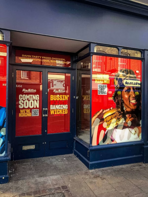
Wallace Print was engaged at an early stage to support this process, beginning with temporary window graphics designed to mask internal refurbishment works while simultaneously promoting the forthcoming opening. These graphics were produced using professional window graphics and large-format printing techniques, ensuring the storefront communicated confidence rather than concealment. Importantly, this initial phase was never treated as a short-term fix, but as the first step in a broader and more considered branding strategy.
As refurbishment progressed and timelines became clearer, the scope naturally expanded into a comprehensive programme of external signage and internal branding. This included permanent shopfront signage, high-visibility elements designed for the surrounding streetscape, and internal graphics that aligned precisely with Miss Millie’s franchise brand guidelines. Wallace Print’s ability to manage print artwork setup and file checks alongside production allowed each stage to transition smoothly without rework or compromise.
What set this project apart was the close working relationship between Wallace Print and the franchise owner. Rather than a single handover of files, the project developed through ongoing dialogue, site understanding, and collaborative problem-solving. This approach allowed decisions to be made quickly, adaptations to be handled calmly, and quality to remain consistent, even under the pressure of a high street opening deadline.
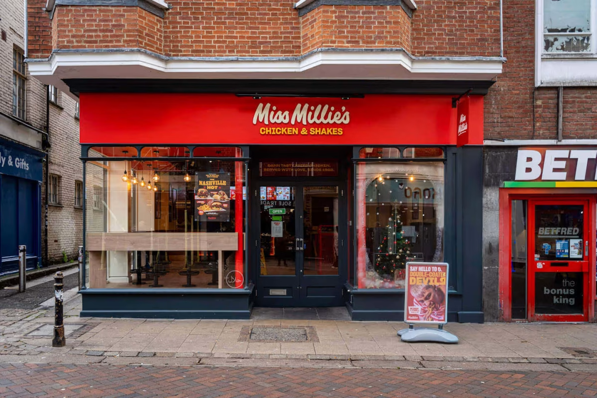
By the time Miss Millie’s Canterbury was ready to open its doors, the visual identity of the store had already done much of the heavy lifting. The completed branding communicated confidence, professionalism, and clarity, ensuring the business launched not as an unknown newcomer, but as a credible and exciting addition to Canterbury’s food scene.
About the Client
Miss Millie’s operates as a franchised fried chicken brand with a strong emphasis on consistency, recognisable visual identity, and strong high street visibility. While the brand itself is well established nationally, each new franchise location represents a significant personal and commercial commitment for the individual operator. In Canterbury, that commitment was particularly meaningful, as this location marked the client’s return to business ownership.
The decision to open the store followed a period of retirement, and the client was candid about what motivated the move back into running a business:
“To put it frankly, I got bored, and after trying Miss Millie’s product, the decision was made easy!”
This response provides important context for the project. The Canterbury store was not simply a commercial investment, but a deliberate and energising re-entry into entrepreneurship. From the outset, it needed to feel credible, professional, and rewarding, both personally and commercially.
Rather than starting an entirely new concept, the client chose to operate under a franchise model, valuing the structure and experience that came with it:
“You start from an elevated position because they have already made nearly all the possible mistakes, so you don’t have to.”
That same thinking carried through to the physical environment. The client understood that while product quality would drive repeat visits, the first impression would be shaped by how confidently the store presented itself visually. Clear signage, considered branding, and professional print execution were essential in reinforcing the strength of Miss Millie’s brand from day one.
Location played a critical role in those decisions. After spending two years assessing potential sites across Kent, the client consistently returned to Canterbury:
“From the start, I was always drawn back to Canterbury because it is simultaneously rustic and vibrant… Very similar to Miss Millies.”
Canterbury’s blend of residents, students, and visitors meant the store would be seen by a wide and constantly changing audience. Many of those passing by would be encountering Miss Millie’s for the first time. This placed even greater importance on clear window graphics, external signage, and internal visual cues that could communicate the brand quickly and confidently. This is where Wallace Print’s experience in window graphics and high-impact printing services became a key part of the project’s success.
For the client, print and branding were not treated as finishing touches added at the end of a fit-out. Instead, they were seen as foundational tools for launching the business correctly. Wallace Print’s role was to translate that ambition into a physical environment that supported both Miss Millie’s brand and the individual behind the franchise, ensuring the store opened with confidence, clarity, and immediate presence on the high street.
The Brief and Challenge
The brief for Miss Millie’s Canterbury developed over time, reflecting the realities of opening a new hospitality venue while refurbishment works were still underway. At the earliest stage, the primary requirement was practical but strategic. The shopfront windows needed to be covered to hide ongoing internal works, but the client was keen to avoid the unit looking closed, unfinished, or inactive on a busy high street.
Rather than treating this as a temporary inconvenience, the client saw the window space as an opportunity to start communicating the brand before opening day. The aim was to use high-impact window graphics to build awareness, signal what was coming, and ensure the store already felt part of the high street despite being weeks away from trading.
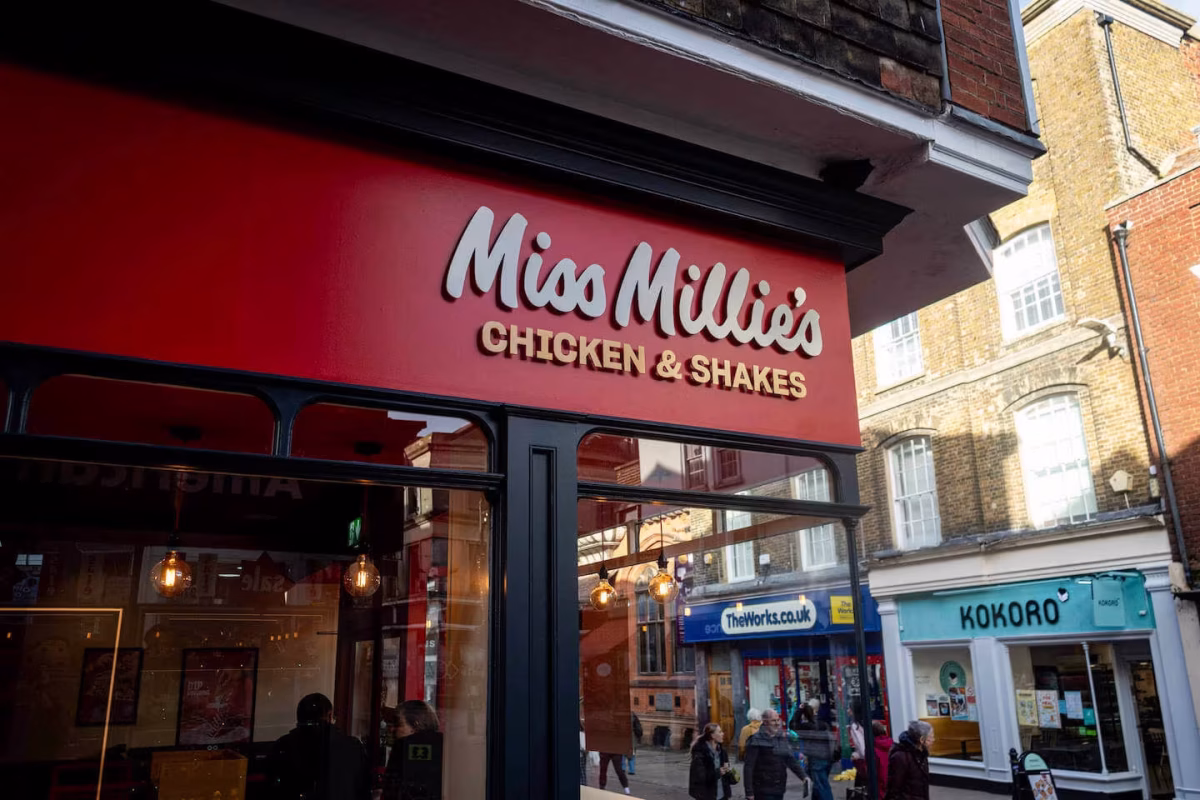
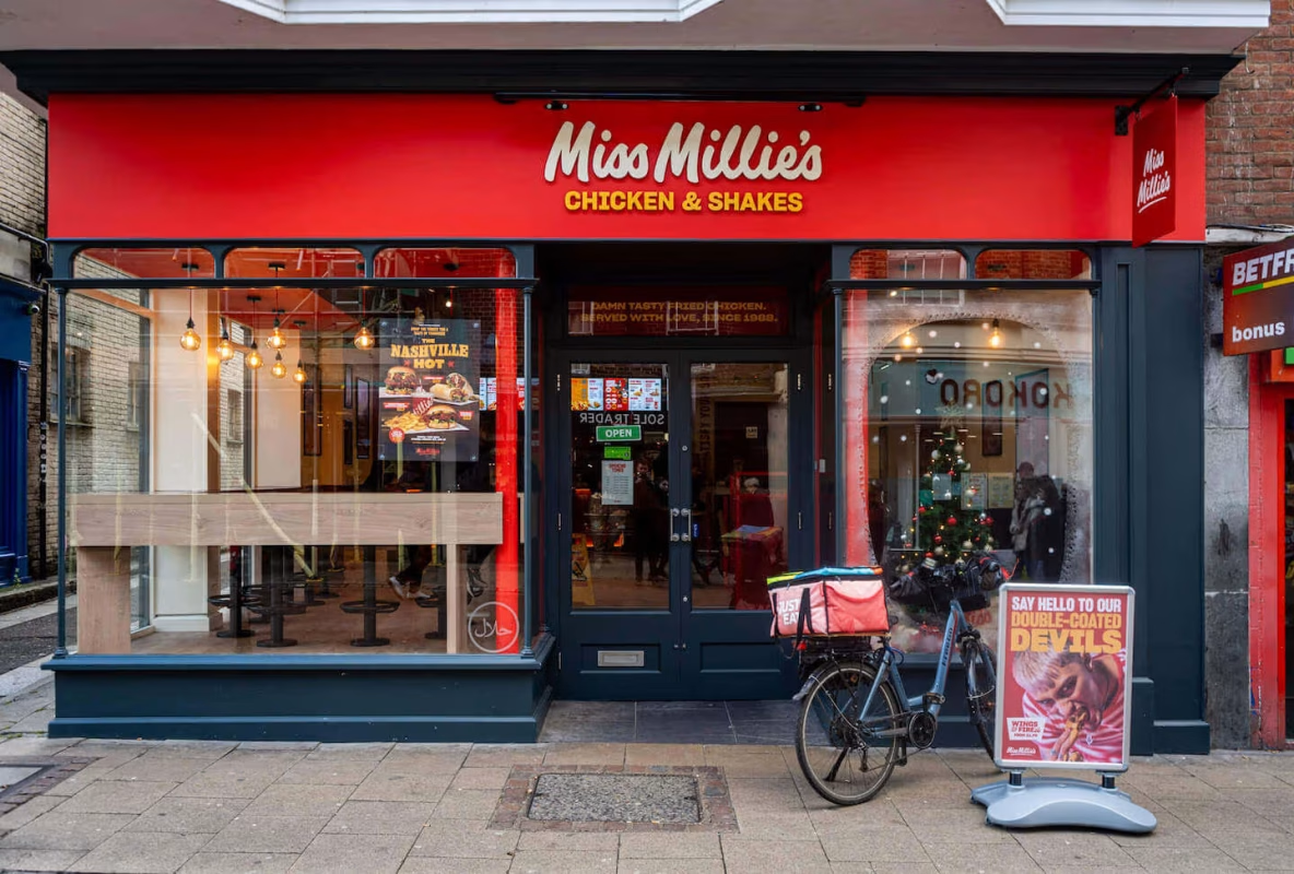
As the project progressed, the scope expanded significantly. Once refurbishment timelines were confirmed, attention shifted towards creating a permanent external presence that would work long after launch. This included multiple external signage elements designed to maximise visibility from different angles along the street. These ranged from a double-sided swing sign printed on Dibond to main fascia signage produced using stove-enamelled panels with stand-offs, creating depth and presence in a competitive retail environment.
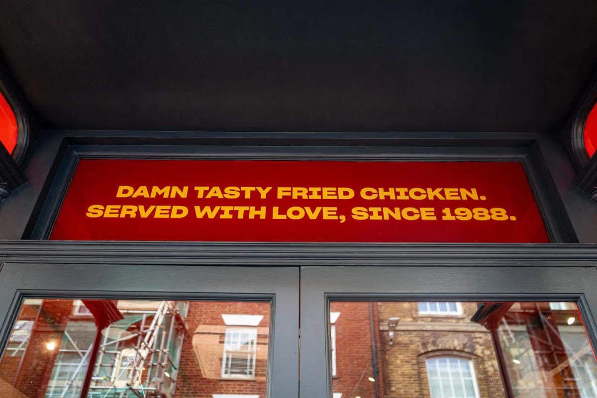
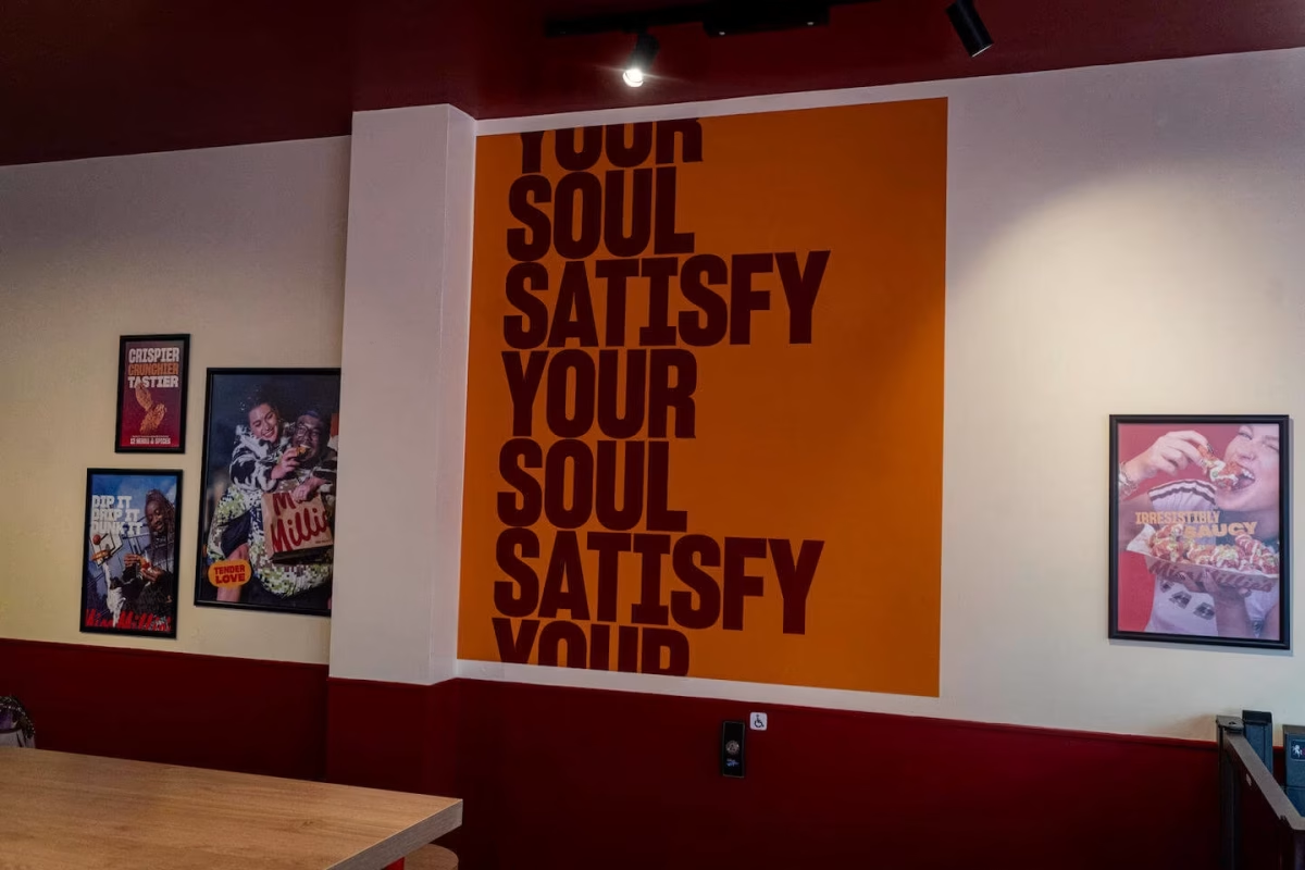
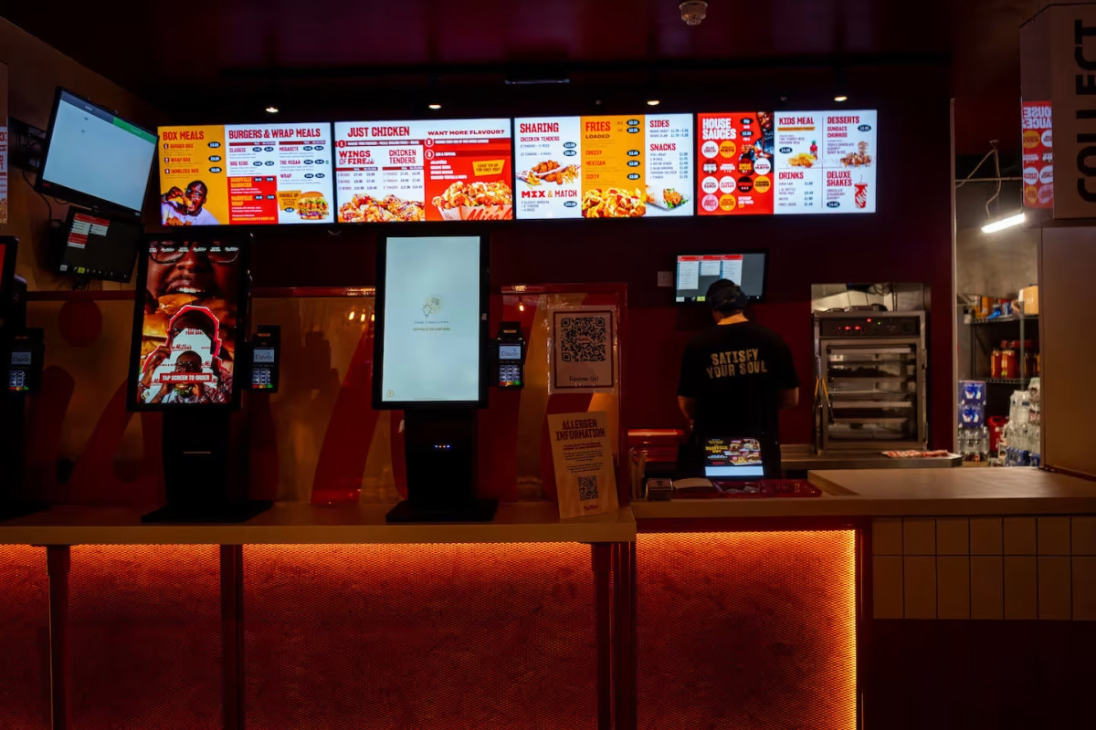
Internally, the challenge was equally considered. The store layout needed to guide customers clearly through ordering and collection, while also masking certain operational areas. The client highlighted the importance of avoiding blank or underwhelming interior spaces, particularly walls that would otherwise feel empty or purely functional. This led to the inclusion of internal cut vinyl text, square cut wall posters aligned to brand guidelines, and boxed Order and Collection signage to support customer flow and clarity.
Throughout the brief, there were also practical constraints that shaped how the work was delivered. Installation had to take place within restricted morning time windows to comply with local high street permit regulations. Certain elements required working at height using ladders, meaning safety planning and efficient sequencing were essential. At the same time, deadlines were tight, with the main external graphics and signage needing to be completed in time for the store’s soft launch.
What made this brief distinctive was not just the range of materials or outputs, but the expectation that everything needed to work together as a cohesive whole. Temporary and permanent elements had to feel connected. External and internal branding needed to align seamlessly. And most importantly, the finished environment needed to reflect both Miss Millie’s brand and the personal investment of a franchise owner opening their first location.
This set the foundation for Wallace Print’s approach, combining technical planning, mixed media production, and phased delivery to meet both creative ambition and real-world constraints.
Our Solution
Wallace Print became involved immediately after the Canterbury site was secured, allowing the project to be approached holistically rather than reactively. Early engagement meant the team could understand the physical constraints of the unit, the pace of the refurbishment programme, and how the branding would need to evolve from temporary coverage to permanent high street presence.
This early involvement was important to the client, who wanted a supplier that fully understood the venue and the pressures of a first franchise launch:
“Directly after securing the property, Wallace Print was engaged. It was important for us that they knew the venue and our requirements inside and out.”
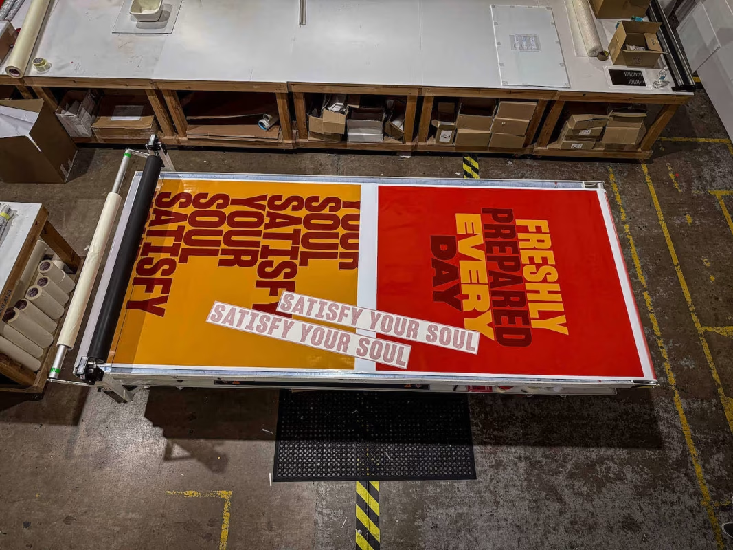
The initial phase focused on producing temporary window graphics to cover refurbishment works while actively promoting the forthcoming opening. These were designed and produced using high-quality window graphics solutions, ensuring strong colour reproduction, full coverage, and a professional finish that prevented the unit from appearing vacant during works.
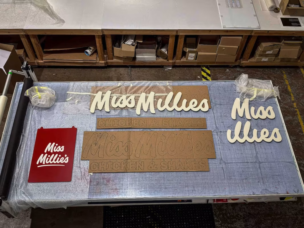
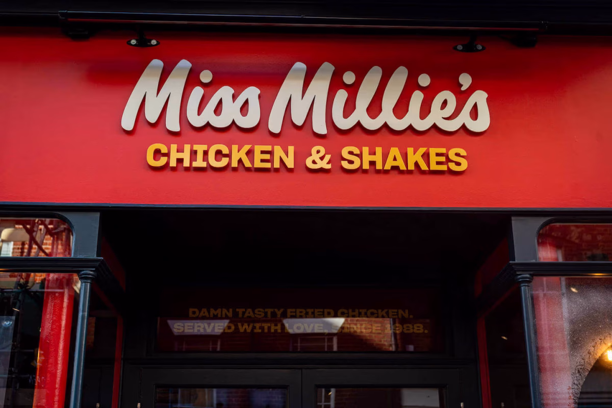
As the project progressed, Wallace Print delivered a broader suite of branding elements spanning both external and internal environments. External signage included a double-sided swing sign printed on aluminium composite, white cut acrylic lettering colour-matched to Miss Millie’s red RAL specification, and stove-enamelled main signage mounted on stand-offs to maximise visibility from multiple directions on the high street. These elements were produced using a combination of direct-to-media printing and UV flat-bed digital printing to achieve durability, colour accuracy, and long-term performance.
Internally, Wallace Print supplied cut vinyl wall text, square cut wall posters, and clearly defined Order and Collection signage. These elements were designed to align strictly with Miss Millie’s franchise brand guidelines while also responding to the specific layout of the Canterbury store. Before production, all artwork went through artwork setup and file checks to ensure correct sizing, colour consistency, and suitability for the chosen materials.
Throughout production and installation, attention to detail was prioritised. One example was the decision to paint fixings to reduce their visibility once installed, a small adjustment that improved the overall finish and demonstrated care beyond basic compliance. Installation was carried out within restricted morning time windows in line with high street permit requirements, with Wallace Print’s print installation team managing working at height safely and efficiently.
From the client’s perspective, the value of Wallace Print’s approach was felt not just in the final output, but in how challenges were handled along the way:
“Nothing was too much for Dan, and even when things didn’t go to plan, as they inevitably always do, the product was not delivered until it was just right.”
By combining structured project management, technical production expertise, and a calm, solutions-focused approach, Wallace Print ensured the store launched with branding that felt confident, cohesive, and ready for the demands of a busy Canterbury high street.
The Role of Print and Visual Branding
For Miss Millie’s Canterbury, visual branding was not treated as a decorative layer added at the end of the fit-out. From the client’s perspective, print played a direct role in whether the business would be noticed, understood, and chosen by people walking past the store for the first time.
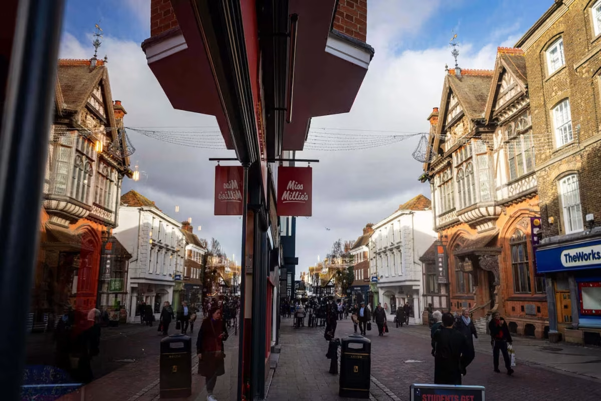
Operating in a city like Canterbury meant engaging with a constantly changing audience. Locals, students, day visitors, and tourists all pass through the high street daily, many of whom may never have encountered the Miss Millie’s brand before. The client was clear that in this context, signage and graphics needed to work immediately and intuitively.
“Miss Millies draws on these aspects greatly, especially in a location such as Canterbury, because it has such a vast array of visitors to the area that may not have heard of Miss Millies. The correct signage, wall graphics and visual branding is a must to help entice that clientele through the door… The smell will take it from there.”
This understanding shaped how Wallace Print approached the project. External branding was designed to establish presence and recognition from a distance, while internal graphics were used to reinforce the brand story once customers crossed the threshold. Using a combination of large-format printing and clearly structured layouts, the aim was to ensure the store communicated confidence before a single word was spoken by staff.
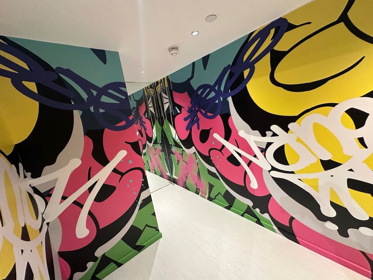
Internally, branding decisions were driven by both aesthetics and function. Large areas of wall space presented a risk of the environment feeling sparse or unfinished, particularly in a newly fitted unit. The client identified this early and worked with Wallace Print to use printed wall graphics to add scale, energy, and consistency throughout the space.
“Breaking up what could have been a boring and empty wall was a must, and that’s where the wall graphics were called upon.”
Wallace Print produced and installed these elements using printed wall graphics that aligned precisely with Miss Millie’s brand guidelines, ensuring colour accuracy, consistent typography, and correct spacing across all surfaces. This helped create a space that felt deliberate and finished rather than improvised.
Beyond visual impact, print was also used to guide behaviour. Clear Order and Collection signage was essential to managing customer flow, particularly during busy periods. These elements needed to be obvious without feeling intrusive, supporting the operational side of the business while maintaining a clean visual environment.
“We also wanted to make sure the customer knew exactly where to go to order, collect, and, at the same time, mask some of the operations and the Order and Collection signs and frosted acrylic panel with the Miss Millies signature did exactly that.”
To achieve this, Wallace Print combined window graphics, internal vinyl text, and rigid signage produced using direct-to-media printing, allowing for durability in high-touch areas while maintaining a premium finish. Careful placement ensured that operational areas were discreetly screened without disrupting the overall openness of the store.
Throughout the process, Wallace Print’s role was not simply to manufacture graphics, but to interpret how branding could solve practical challenges. By understanding how the client wanted customers to move through the space and what impressions needed to be formed at each stage, print became a tool for clarity as much as creativity.
The result was an environment where branding, navigation, and atmosphere worked together seamlessly. Customers encountered a store that felt confident, recognisable, and easy to understand from the moment they approached the frontage to the point of collection. For a first franchise opening, this cohesion was critical and reinforced the client’s belief that investing in professional print and signage was central to launching the business correctly.
The Results
Once Miss Millie’s Canterbury opened its doors, the impact of the visual branding was immediate and tangible. The combination of external signage, window graphics, and internal wayfinding worked together to give the store a confident, established presence from day one, despite being a brand-new opening.
From the client’s perspective, the most telling outcome was how quickly the store became recognised locally. Reflecting on the response from the city, the franchise owner commented:
“Of course, Miss Millie’s Canterbury has become the talk of the city and is largely down to the work of Wallace print.”
This reaction reinforced the original intention behind investing in strong visual communication. In a city with a high turnover of visitors and students, many customers were encountering the brand for the first time. The clarity of the external branding helped introduce Miss Millie’s immediately, while the internal graphics ensured the experience once inside felt intuitive and polished.
Why Wallace Print?
This project is a strong example of why Wallace Print is trusted by franchise operators and retail brands delivering high street openings under pressure. From the earliest stages, the focus was not simply on producing print, but on understanding how signage, graphics, and layout would support a first-time store launch in a competitive, high-footfall location.
Wallace Print became involved immediately after the property was secured, allowing the team to build a full understanding of the site, constraints, and brand requirements before production began. This early collaboration proved critical in avoiding delays and ensuring that all elements were delivered in the correct sequence. As the client explained:
“I was introduced to Dan at Wallace Print, and we seemed to hit it off straight away. Understanding our requirements was key, and Dan did just that.”
Rather than operating as a reactive supplier, Wallace Print acted as a project partner, advising on materials, finishes, and installation planning. This included guidance on temporary window graphics to support refurbishment works, permanent external signage for brand visibility, and internal wall graphics and directional signage to guide customers clearly once open. Each element was produced using appropriate methods across large format printing, direct to media printing, and UV flat bed digital printing, ensuring consistency across mixed materials.
The client also highlighted the importance of calm, reliable delivery during a time-pressured build programme:
“He always kept his cool under pressure, even when I didn’t, and delivered a product that exceeded my expectations.”
This reliability extended through production and installation. Working within restricted morning installation windows and high street permit requirements, Wallace Print coordinated print finishing, plotter and CAD cutting, and installation services to ensure the store was ready for its soft launch without compromise on quality.
Perhaps most telling is the client’s reflection on what they would do differently next time:
“Yes, I would trust and listen to Dan more!”
That statement reflects the confidence built through the process. Wallace Print’s combination of technical capability, clear communication, and genuine investment in the client’s success positioned them not just as a supplier for this store but as a trusted partner for future franchise locations.
“I certainly would recommend Wallace Print and not just because they deliver a great service and product, which they do, but they also care about their business and clients and it shows.”
For franchise operators balancing personal investment, brand compliance, and commercial pressure, Wallace Print provides the reassurance that every detail will be handled properly, from artwork setup and file checks through to final on-site installation.
We’re here if you need us
If you are planning a new store opening, franchise rollout or high street refurbishment, Wallace Print can support your project from initial consultation through to installation.
We work with hospitality brands, franchise owners, and agencies to deliver compliant, brand-led print solutions, including window graphics, signage, wall graphics, and full-site branding. Explore our full range of Printing Services, or Contact Us to discuss how we can support your next opening with confidence.
For more information about large format print and to discuss your next project, please contact us on 01634 724 772 or email us at sales@wallaceprint.com
Get in touch via our contact form to find out more about how Wallace Print can help you transform your print project. Our expert account managers are on hand to provide advice, quotes, and assistance – however, and wherever you need it.
Get in touch via our contact form to find out more about how Wallace Print can help you transform your print project.