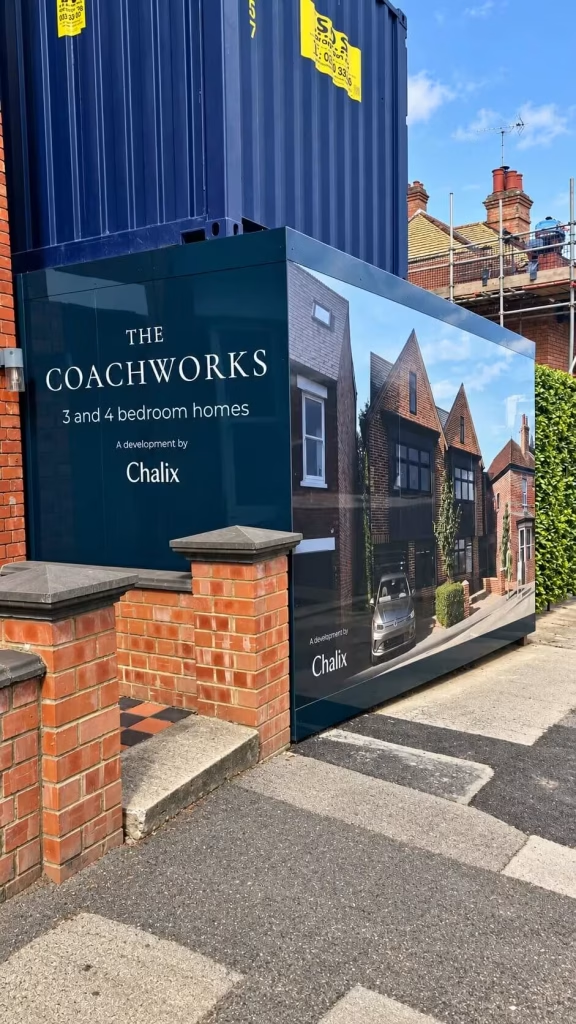
Chalix Coachworks Development Hoarding


Chalix Coachworks Development Hoarding
Ten design concepts, two Pantone colours, one continuous design across two hoarding sections.
Opening stat line: Ten design concepts, two Pantone colours, one continuous design across two hoarding sections.
Project summary
| Client | Chalix Ltd |
| Location | Thame, Oxfordshire |
| Project type | Design, print and installation of ACM development hoarding, now confirmed complete |
| Scale | Two hoarding sections either side of an access gate, 3,780 x 2,440mm and 10,090 x 2,440mm, produced as eleven ACM panels at a standard 1220 x 2,440mm sheet size. The panel count lines up closely with the combined run of both sections, confirming the original brief’s figures were in millimetres |
| Key services | Artwork development from client CGIs and logos, ten design concepts, Pantone 546C and 558C spot colour matching with a physical proof pulled for client approval, digital print directly onto 3mm ACM with an anti-graffiti laminate to one side, CAD cut to size, and installation |
The Project
Chalix approached Wallace Print about printed hoarding for The Coachworks, a development in the centre of Thame, positioned in two sections either side of an access gate. Chalix wanted the hoarding to introduce the development, show off the scheme through architectural CGIs, and bring together the identities of Chalix and the other organisations involved in the project, rather than functioning as plain site fencing.
The client had a clear idea of what the finished hoarding should look like, and had already put together initial concepts using AI, but arrived without a finished, print-ready design. Several of the images and partner logos were still being finalised when the project began, so a meaningful part of Wallace Print’s work was building a coordinated design from evolving source material, rather than simply producing artwork that was already supplied in a finished state.

The Brief
Chalix supplied five images, four interior visuals and one exterior visual, along with company logos for Chalix and five project partners, Darren Hunt, Enza, OMK, CHH and Sancus. Not all six logos were available at the outset: some arrived later in the project, and some of the earlier versions weren’t high resolution.
The brief was for Wallace Print’s studio to turn this material, together with the client’s own AI-generated concept ideas, into design concepts for The Coachworks hoarding, bringing the architectural visuals and the different partner identities together across both hoarding sections. The studio ultimately developed ten design concepts for the client’s review.
The client specified two Pantone references, 546C and 558C, that needed to be reproduced consistently across both sections, and asked that the finished design, read as a professionally developed rather than retaining the look of an AI-generated image.
How It Was Done
To understand the site the artwork would sit on, Wallace Print asked Chalix for photographs or visuals showing how the existing timber structure either side of the access gate was arranged. Chalix supplied a current street-view photograph along with revised interior and exterior CGIs, and confirmed that the finished boards would be capped. The sizing and survey information for the site came from the client rather than an independent Wallace Print site visit, which the studio has flagged as the trickiest part of the job: understanding the client’s layout requirements and making sure the sizing was correct when working from a client-supplied survey rather than one carried out directly.

Working from the supplied CGIs, logos and the client’s own AI-generated concept, the studio worked through ten design revisions developing the artwork as a single continuous design across both hoarding sections, rather than as two separate files either side of the gate.
Colour was a specific part of the brief. A Pantone reference is a precise starting point, but it doesn’t guarantee how a colour will look once it’s converted for large-format print and reproduced on a different material, so the studio worked the two supplied references, 546C and 558C, into the artwork with the print process in mind, keeping both as spot colours for the print run rather than converting them to CMYK. A physical proof was pulled and sent to the client for approval, rather than relying on a screen proof alone.
The panel material quoted for the job was ACM (Aluminium Composite Material), the same type of board Wallace Print uses for construction site hoarding generally, and the quote also included headers and kickers.

The Outcome
The finished hoarding at The Coachworks is now complete: ten design concepts were developed down to one coordinated scheme, two exact Pantone spot colours were matched and proofed physically, and eleven ACM panels were digitally printed and installed across both sections either side of the access gate, finished with an anti-graffiti laminate and cut to size.

Why Wallace Print
The value in this job sits as much in the studio work behind it as in the finished, installed hoarding: turning an evolving set of CGIs, partner logos and an AI-generated concept into ten design concepts and one coordinated design, then hitting two exact Pantone spot colour requirements in large-format print rather than on a screen.
Getting specific brand colours to hold together across two separate hoarding sections, starting from Pantone references rather than finished, print-ready artwork, is studio work that won’t show up in a finished photograph, but it’s what makes the installed result look considered rather than assembled.
If you’re planning development hoarding of your own, or you have a concept and branding but no production-ready artwork to work from, contact Wallace Print at sales@wallaceprint.com or 01634 724 772.
Products and Services Used
- Hoarding artwork development and design
- Printed hoarding graphics
- ACM (Dibond) panel material
- Pantone colour matching for large-format print
- ACM Anti Graffiti Lamination
- Hoarding Panel Installtion
Frequently Asked Questions
Has the hoarding been produced and installed yet?
Yes. Eleven ACM panels were digitally printed and installed across the two hoarding sections either side of the access gate.
What material was specified for the hoarding?
3mm ACM (Aluminium Composite Material), digitally printed directly onto the material rather than applied as vinyl, finished with an anti-graffiti laminate to one side and CAD cut to size.
How did Wallace Print match the client’s Pantone colours?
The client specified two Pantone references, 546C and 558C. The studio worked both into the artwork with the large-format print process in mind, kept them as spot colours for the print run rather than converting to CMYK, and pulled a physical proof to send to the client for approval rather than relying on a screen proof alone.
How many design concepts did the studio produce?
Ten, developed from the client’s supplied CGIs, logos and their own AI-generated concept.
How many hoarding sections does the design cover?
Two, on either side of an access gate, produced as eleven ACM panels bringing together CGIs of the development and the partner logos into one continuous design across both sections rather than two separate files.
For more information about large format print and to discuss your next project, please contact us on 01634 724 772 or email us at sales@wallaceprint.com